Fairgrounds (Messegelände) Signage - Case Study
- M72C
- 3 days ago
- 2 min read
[ M72CS : 0003 ]
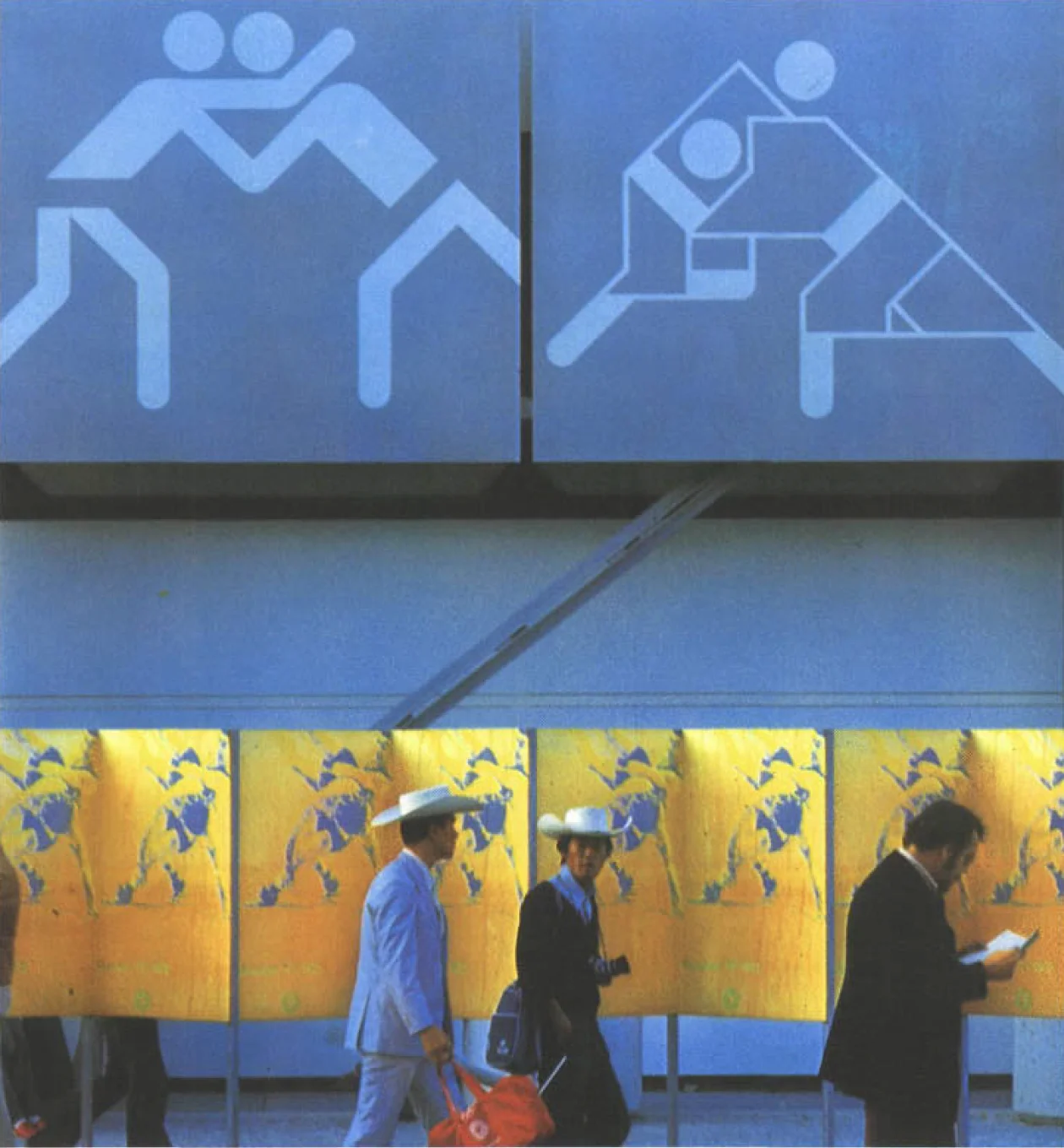
The sign systems created for sports, services, and tourism at Munich 1972 were less influenced by the mainly illustrative signage of Mexico '68 and more by the highly formalised system of Tokyo '64. The movement towards replacing text with sign systems resulted in the Munich signage being designed in an even more concise manner. The goal was not necessarily to invent something new but to further develop what was already in place.
In contrast to the sports pictograms, the second system of signs for the Games included written indications in three languages (German, French, and English), an identifying color (light blue), and a directional arrow.


Messegelände.
The Fairground (Messegelände) halls were part of the facilities proposed by the Organising Committee for the competition and training venues during the Olympic Games. After resolving structural and organisational issues, the crucial task of temporarily transforming a mismatched building complex, constructed over different periods, into a sports center remained.
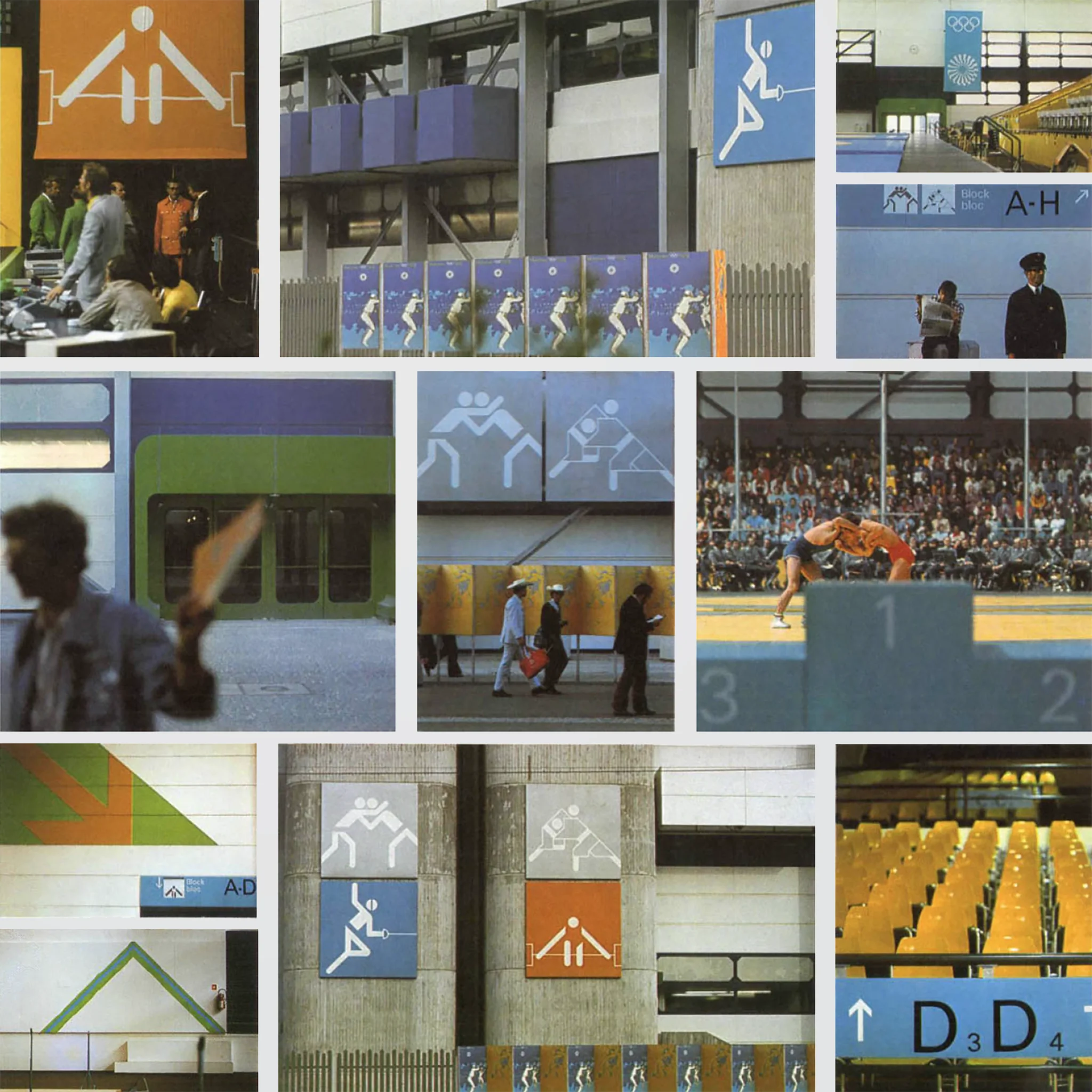
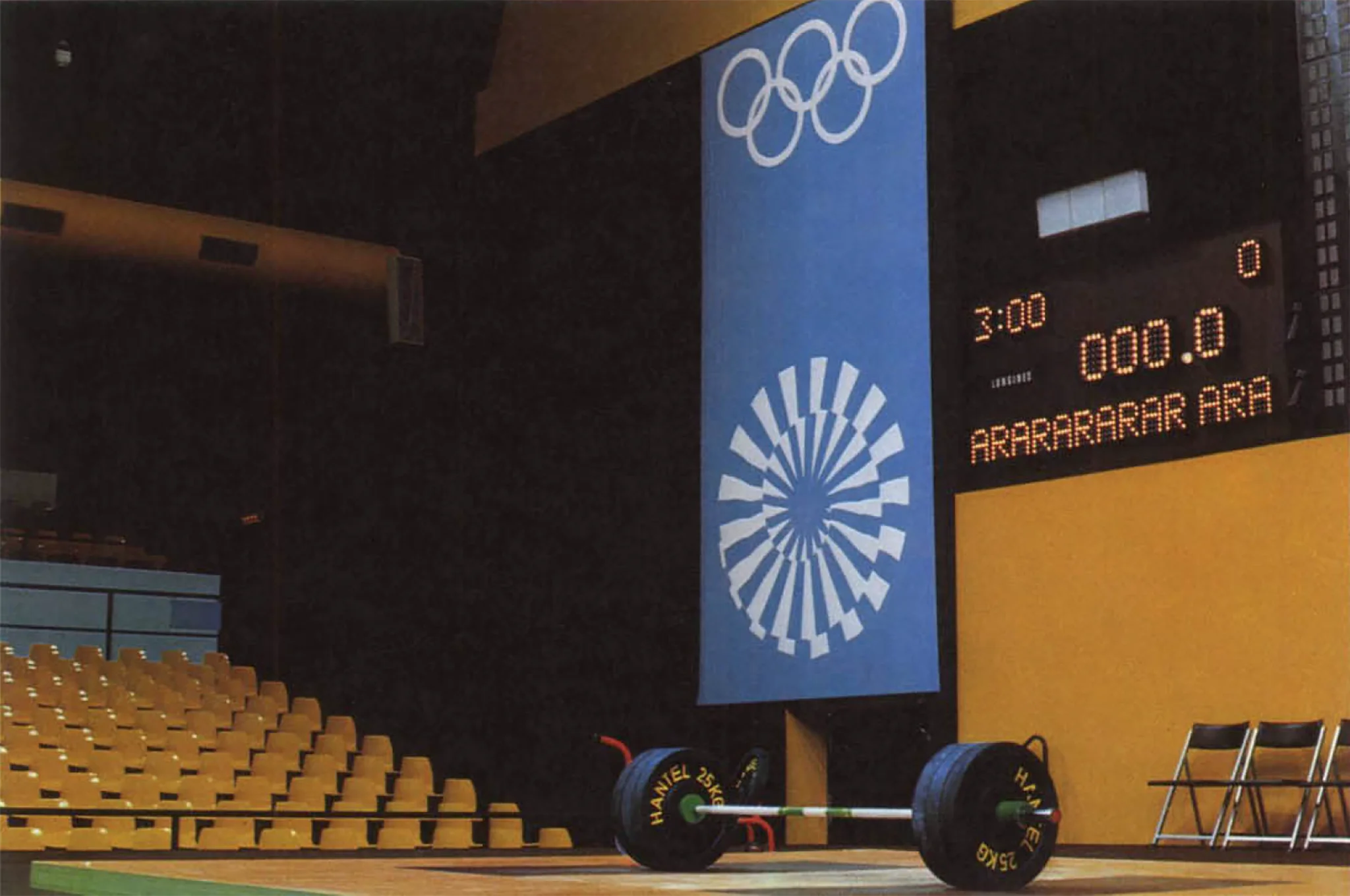
The predominantly somber utilitarian architecture of most existing exhibition buildings needed to be aligned with the "cheerful Games" theme through minimal yet effective measures. The planners utilised the Olympic colours – yellow, green, and blue – in both light and dark shades, as determined by Aicher's Dept XI. These colours, along with informational signs about sports and other facilities, became the primary elements shaping the perception of the Fairgrounds.
About the venues.
Even initially, it was deemed impossible to host every Olympic discipline within the Olympic Park itself. In the early planning stages, however, it was thought that basketball and volleyball events could take place in the exhibition halls. Once the international sports federations specified their requirements for the competition venues, it became clear that the exhibition halls were unsuitable for these sports.

The halls lacked the necessary court dimensions with adequate safety zones (volleyball demands a 12.5 m high ceiling) and seating for around 5,000 spectators. Consequently, the Organising Committee decided to convert the "Munich Fair Company" grounds (5km from the Olympic Park) into the center for heavy athletics, wrestling, judo, weightlifting, and fencing. Facilities were remodelled to serve as competition and training halls for each of these disciplines.
The radio, television, and press subcenters finalised the setup of the second Olympic center at the exhibition grounds. Unlike entirely new facilities, the fairgrounds offered the benefit of existing essential infrastructure such as a post office, restaurant, organisation and meeting rooms, toilets, etc. The traffic access system, proven effective through numerous events, operated seamlessly. A well-organised shuttle service with internal or public transportation between Olympic Park and the fairgrounds made individual transportation almost unnecessary.

– 1. Fencing Hall No.1 / 2. Wrestling & Judo Hall / 3. Weightlifting Hall / 4. Fencing Hall No. 2
Collected.
[ M72C : 0260 / 0261 / 0262 ] Recent additions to the archive


Comments